")
In the competitive digital landscape, a compelling call-to-action (CTA) is crucial for converting passive visitors into active participants. A well-crafted CTA can significantly impact your conversion rates, whether you’re aiming to drive sales, generate leads, or encourage engagement. This article will delve into the essential strategies for crafting a powerful call-to-action that resonates with your audience and motivates them to take the desired next step. From understanding the psychology behind effective CTAs to practical tips on wording, placement, and design, we’ll equip you with the knowledge to transform your CTAs from mediocre to magnificent.
Learn how to create calls-to-action that compel your audience to click, subscribe, buy, and ultimately achieve your business objectives. We’ll explore different types of CTAs, discuss the importance of A/B testing, and provide real-world examples of successful call-to-action implementations. By mastering the art of the call-to-action, you’ll gain a powerful tool for optimizing your website, marketing campaigns, and overall online presence. Get ready to transform your CTAs into powerful engines of growth and engagement.
What Makes a Great CTA?
A great call-to-action (CTA) is more than just a button or a line of text. It’s a carefully crafted element designed to prompt an immediate response from your audience. Several key factors contribute to its effectiveness.
Clarity is paramount. Users should immediately understand what action you want them to take. Avoid vague language and opt for strong action verbs like “Download,” “Register,” or “Get Started.” Conciseness is also crucial. Keep your CTA brief and to the point, focusing on the core benefit or value proposition.
Creating a sense of urgency can significantly boost conversions. Limited-time offers, special promotions, or highlighting scarcity can encourage immediate action. Incorporating strong value proposition is essential. Clearly communicate the benefit users receive by clicking the CTA. What problem are you solving? What value are you providing?
The placement and design of your CTA also play a significant role. Ensure your CTA is visually prominent and easy to find. Use contrasting colors, compelling button designs, and appropriate font sizes to draw attention.
CTA Placement and Visibility
Strategic CTA placement is crucial for maximizing conversions. A poorly placed CTA can easily be overlooked, diminishing its effectiveness. Consider the user’s journey and place CTAs where they logically fit within the flow of information.
Above the fold placement is often effective, ensuring immediate visibility without scrolling. However, don’t prioritize above-the-fold placement if it compromises the user’s understanding of the offer. Sometimes, placing the CTA after providing sufficient context, even below the fold, yields better results.
Ensure your CTA is visually prominent. Use contrasting colors, whitespace, and an appropriate size to make it stand out from the surrounding content. Avoid cluttered designs that bury the CTA or compete for the user’s attention.
Consider the context of the page. A landing page might have multiple CTAs, each guiding the user towards a specific action. A product page, on the other hand, might feature a single, prominent “Add to Cart” button.
Testing different placements and designs is essential for optimizing CTA performance. A/B testing can reveal valuable insights into user behavior and help you determine the most effective strategies for your target audience.
Using Action-Oriented Language
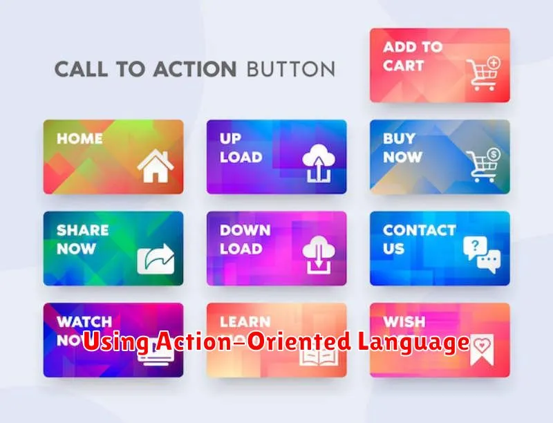
A powerful call-to-action (CTA) relies heavily on action-oriented language. This means using verbs that encourage immediate action and create a sense of urgency.
Instead of passive phrases like “Learn More,” opt for stronger verbs that tell the user exactly what to do. Think “Discover Your Options,” “Get Your Free Quote,” or “Start Your Free Trial.” These phrases are more direct and compelling.
Specificity is also key. Vague language can be confusing and less effective. “Shop Now” is generally applicable, but “Shop New Arrivals” or “Shop Summer Sales” provides more context and direction.
Consider the following examples:
- Weak: Submit
- Strong: Submit Your Application
- Weak: Go
- Strong: Get Started Today
By using strong, specific verbs, you create a sense of immediacy and guide users towards the desired action.
Emotional and Logical Appeals
A compelling call-to-action (CTA) often leverages both emotional and logical appeals to persuade the audience. Emotional appeals tap into feelings and desires. They create a sense of urgency, excitement, or fear of missing out (FOMO). Think about CTAs that use words like “Limited-time offer,” “Exclusive access,” or “Don’t miss out.”
Logical appeals, on the other hand, focus on reason and practicality. They highlight the benefits and value proposition of taking the desired action. These CTAs often emphasize facts, statistics, and demonstrable advantages. For instance, a CTA might state “Save 20% today” or “Get free shipping on your first order.”
The most effective CTAs often blend these two approaches. By combining the emotional pull of desire with the logical justification of value, you create a powerful incentive for the audience to act. For example, a CTA could say “Join our exclusive community today and get access to premium resources” appealing to both the desire for belonging and the practical benefit of valuable resources.
A/B Testing CTAs
A/B testing is a critical component of optimizing your CTAs. This method involves creating two versions of your CTA (version A and version B) with variations in elements like wording, button color, size, or placement. Then, you show each version to a similar segment of your audience and track which performs better based on your desired conversion metric (e.g., clicks, form submissions, purchases).
For example, you might test “Get Started Now” against “Try it Free.” Or, you could compare a red button to a green one. Track the click-through rate (CTR) for each version. The version with the higher CTR is generally the more effective CTA.
Careful planning is essential. Define your goals and what you want to achieve with your CTA before you start testing. Decide which variations you’ll test and what metrics you’ll use to measure success. Document your findings for future reference and iterative testing.
Remember to test one variable at a time to isolate its impact. Changing multiple elements simultaneously can make it difficult to determine which change influenced the results. A/B testing is an ongoing process. Continue to refine your CTAs through repeated testing to maximize their effectiveness.
Mobile-Friendly CTA Design
Designing effective CTAs for mobile requires careful consideration of the smaller screen size and user behavior. Visibility is paramount. Ensure your CTA button stands out from the surrounding content. Use contrasting colors and sufficient white space to make it easily noticeable.
Size and placement are also crucial. The button should be large enough to tap comfortably with a finger, but not so large that it dominates the screen. Place it in a prominent location, ideally within the user’s thumb zone for easy access. Consider a fixed or floating CTA that remains visible as the user scrolls.
Concise and action-oriented text is essential. Use strong verbs and clear language that tells the user exactly what to expect. Examples include “Get Started Now,” “Download Free Trial,” or “Learn More.”
Test different CTA variations to determine what resonates best with your mobile audience. A/B testing can help you optimize the design, placement, and wording of your CTA for maximum conversion rates. Track key metrics like click-through rates and conversions to make data-driven decisions.
CTA for Email vs Web
While both email and web CTAs aim to drive action, their context and execution differ. Placement is key. Web CTAs often reside within pages, alongside content, prompting immediate action. Email CTAs, however, arrive in a user’s inbox, requiring a compelling subject line and email body to even be seen. Therefore, email CTAs need stronger introductory context.
Design also plays a distinct role. Web CTAs benefit from visual cues and interactive elements, like animations or hover effects, to attract attention. Email CTAs, restricted by email client limitations, often rely on clear, concise text and button design. They should also be optimized for different devices.
The objective can also influence the CTA. A website CTA might guide a user through the sales funnel, encouraging exploration and engagement. Email CTAs are often more direct, focusing on a specific action like purchasing a product, registering for an event, or downloading content.
Finally, testing and analysis differ. Website CTAs are easier to A/B test, allowing for continuous optimization based on user behavior. Email CTAs, though testable, offer a more limited window for analysis, relying heavily on open and click-through rates to measure effectiveness.
Common CTA Mistakes to Avoid
Creating a compelling call-to-action (CTA) is crucial for converting visitors into customers. However, even small mistakes can significantly impact its effectiveness. Avoiding these common pitfalls will help maximize your CTA’s potential.
One frequent mistake is vagueness. CTAs like “Click Here” or “Learn More” lack specific direction and fail to convey the value proposition. Instead, use action-oriented language that clearly tells the user what to expect, such as “Download Your Free Guide” or “Get a Personalized Quote.”
Another common error is lack of clarity regarding the next step. Users should immediately understand what will happen after clicking the CTA. Clearly communicate the desired outcome, whether it’s signing up for a newsletter, making a purchase, or downloading a resource.
Finally, poor placement and design can hinder a CTA’s visibility. Ensure the CTA is prominently displayed and visually appealing. Use contrasting colors and sufficient white space to make it stand out from the surrounding content. Consider the user experience and place the CTA where it naturally fits within the user journey.
Analyzing CTA Performance
Analyzing your call-to-action (CTA) performance is crucial for optimizing conversion rates. Tracking key metrics provides insights into what works and what needs improvement. Start by monitoring your click-through rate (CTR). This metric measures how often your CTA is clicked compared to how often it’s viewed. A low CTR might indicate a weak CTA message or poor placement.
Beyond CTR, consider tracking conversion rate. This measures how many clicks ultimately lead to the desired action, whether it’s a purchase, sign-up, or download. A high CTR with a low conversion rate suggests a disconnect between the CTA and the landing page or offer.
A/B testing is an effective method for optimizing CTA performance. Test different versions of your CTA by varying elements like the wording, color, or placement. Track the performance of each variation to determine which performs best.
Finally, don’t forget to analyze bounce rate for your landing pages. A high bounce rate after clicking a CTA may indicate that the landing page doesn’t align with user expectations or that the page has usability issues.
Examples from Real Campaigns
Examining successful campaigns provides valuable insights into crafting compelling CTAs. Let’s analyze a few examples.
A software company offering a free trial used the CTA “Start Your Free Trial Today“. This CTA is action-oriented, emphasizes the value proposition (free), and creates a sense of urgency (today).
An e-commerce store running a limited-time sale employed the phrase “Shop the Sale Now – Ends Tonight!“. This example uses strong action verbs (shop), highlights the scarcity (ends tonight), and encourages immediate action.
A non-profit organization seeking donations implemented the CTA “Donate Now and Make a Difference“. This emphasizes the impact of the donation and provides a clear instruction (donate now). These examples demonstrate the key principles of effective CTA design: clarity, value, urgency, and a strong call to action.